
Strategy
Creative Positioning
Culture
Descriptor
Design Extension
Typography
Starting Point
sclable creates AI and data-driven innovation solutions for giants like Austrian Federal Railways (ÖBB), voestalpine or Berlin Hyp.
The challenge was to sharpen their strategic positioning and evolve the brand into a clearer, more distinctive expression of how they already work — moving systems, organisations and people forward.
Creative Strategy
We looked closely at how sclable does things. Then redefined their culture around being brave, in it together, moving in action, and being nifty.
A new brand spirit – “We are the Movers and Shakers" – defines sclable as those with real influence in their field. And informed a clear definition for what they do: “We create transformation solutions that move – with design, data, tech and human power."
Design with Purpose
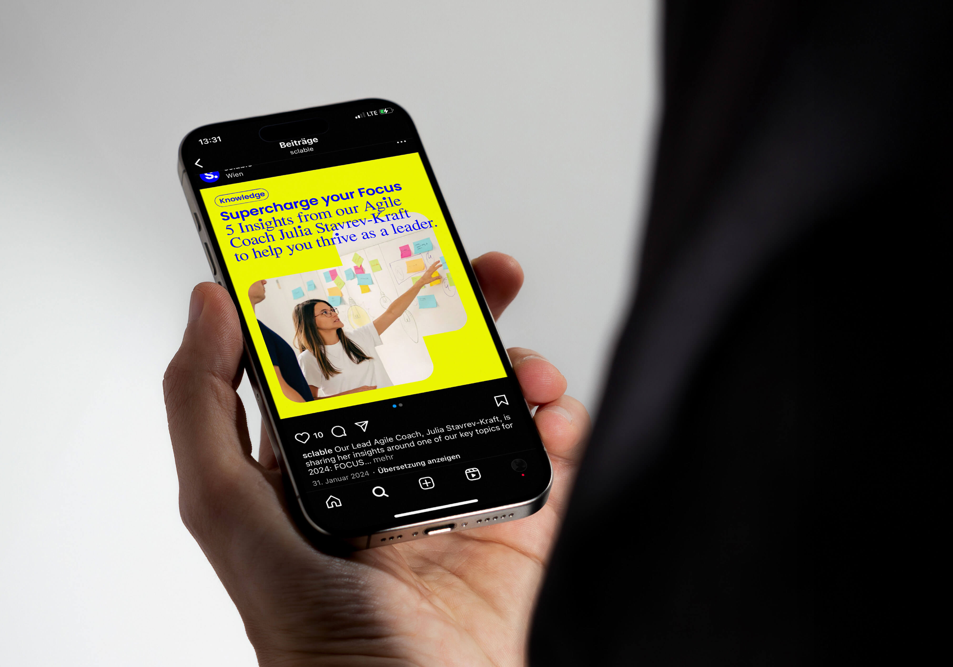
Building on the existing logo, blue and typeface, we introduced “sclable labels” – playful shapes inspired by their workflows, tools and processes – and further expanded the design system with a bright, activating secondary color palette.
Rounding it all up typographically with Times Dot to add visual rhythm and flow to the new tone of voice we defined: tech-savvy, with conviction, in a humble and slightly nerdy way.


“You nailed it. I love it all. Exactly what we needed."




Up next


