
Strategy
Brand Architecture
Culture & Values
Identity Design
Custom Type
Signage
Environments
Starting Point
Vienna's centre for queer culture and history outgrew its former space, evolving from a small research hub into a new place over four floors that brings archive, library, exhibitions, and events together under one roof.
It creates vital room for community, scholarship, and dialogue – at a time when queer history must be protected, shared, and made visible more than ever, as rights and visibility are increasingly under pressure. Again.
Creative Strategy
Diving into the archives – from Vivienne Westwood's invite for the 1997 Life Ball to the first queer zines in Vienna around 1900 – the strategy positions Qwien as an open, cultural centre with a clear role for today’s challenges: “Our Voice. Our Space. Our Story.”
We also defined its new voice and organizational structure, clustering its work across culture, collection, research, and education.
Design with Purpose
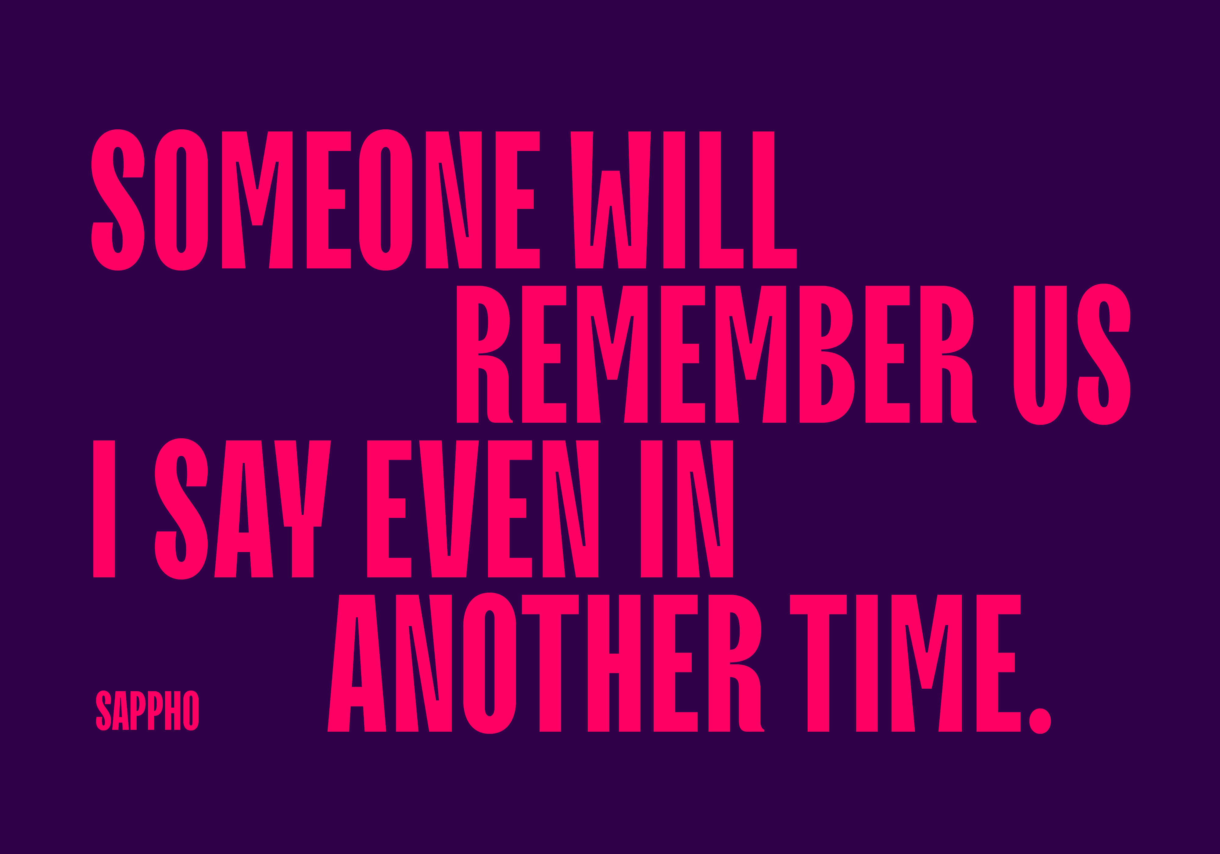
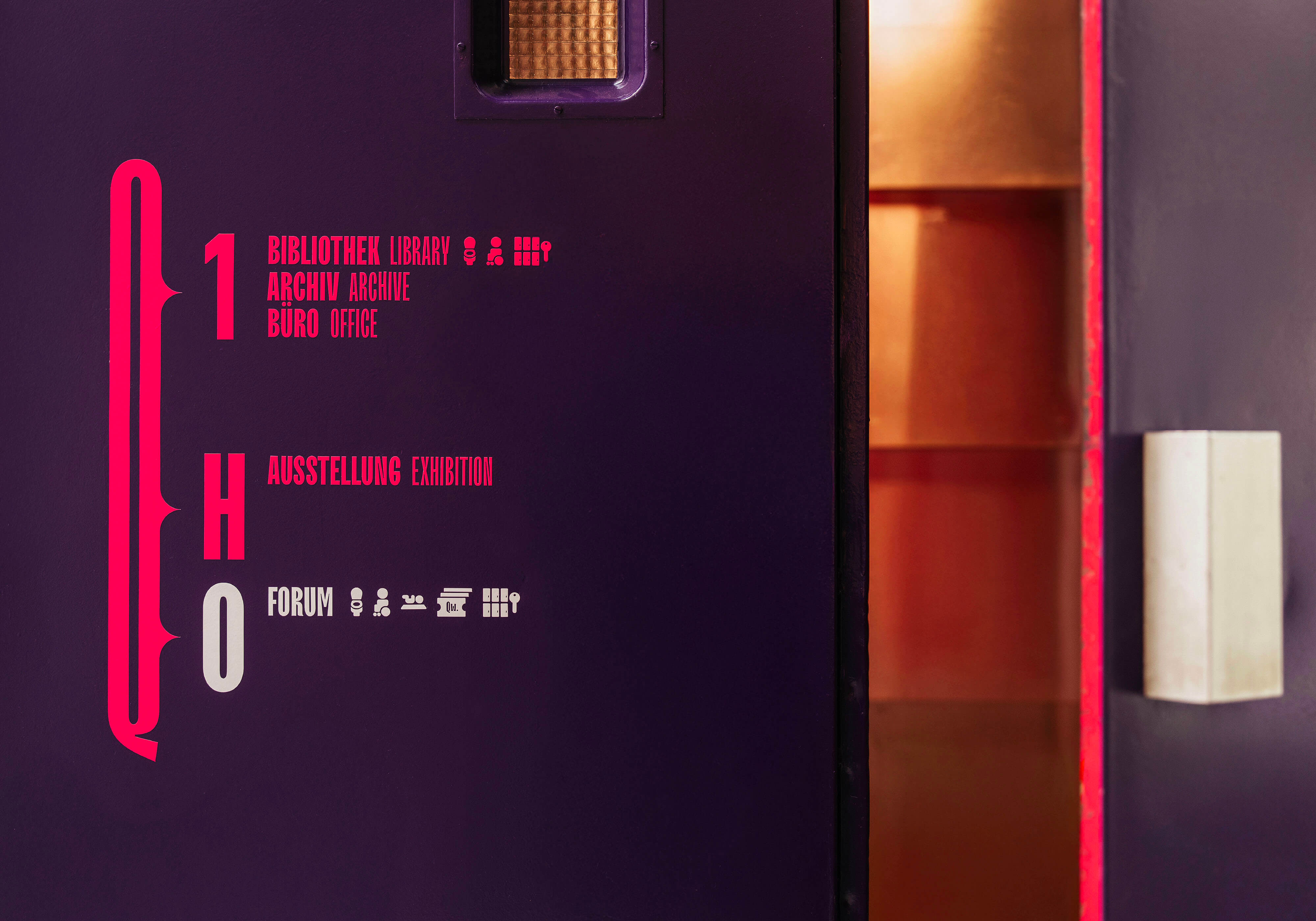
The identity translates into a bold, flexible system: striking typography, expressive messaging, and the vibrant Qwien Pink & Ink create strong visibility and attention. A customised font forms the basis – adaptable, distinctive, and easy to use.
The creative expression is visible and, of course, loud & queer! Qwien invites participation and carries queer history forward to new, larger audiences.


“DUO made us visible, strong and unmistakably Qwien."




An identity back at the core of what queer culture always has been – loud and proud!


Architecture and Interior – koerdtutech, Luciano Parodi
Photography – Gregor Hofbauer, Max Sohm
Type Modification – TypeType
Up next
